7 Effective Tips to Master Type Pairing & Hierarchy While Working Efficiently in Design
Typography is the backbone of every great design. Beyond colors and images, it’s the fonts and how they’re arranged that truly guide the viewer’s eye. If your design feels unbalanced or unprofessional, chances are the issue lies in your type pairing & hierarchy in design.
Mastering these two concepts can instantly transform your work whether it’s a website, a business flyer, a social media graphic, or a brand identity. In this guide, we’ll explore 7 proven tips that will help you understand type pairing, create strong hierarchy, and ensure your typography communicates with clarity and impact.
What is Type Pairing & Hierarchy in Design?
Before diving into the tips, let’s define the terms:
- Type Pairing is the art of combining two or more fonts that complement each other. The goal is to achieve balance and contrast without creating conflict.
- Typography Hierarchy refers to the way fonts are organized headings, subheadings, and body textto guide the reader’s attention and highlight what’s most important.
When used together, type pairing and hierarchy not only make your designs beautiful but also functional and user friendly.

Why Type Pairing & Hierarchy in Design Matter
Typography has personality. Fonts can feel professional, playful, modern, or traditional. Pairing the wrong ones can send mixed signals, while creating no hierarchy can confuse your audience.
Imagine reading a blog where the headline looks exactly like the paragraph text you wouldn’t know what to focus on. Or think of a financial report written in a comic-style font it would instantly lose credibility. That’s why type pairing & hierarchy in design are essential for clarity, brand identity, and reader engagement.
7 Proven Tips for Mastering Type Pairing & Hierarchy in Design
1. Use Contrast to Create Visual Interest
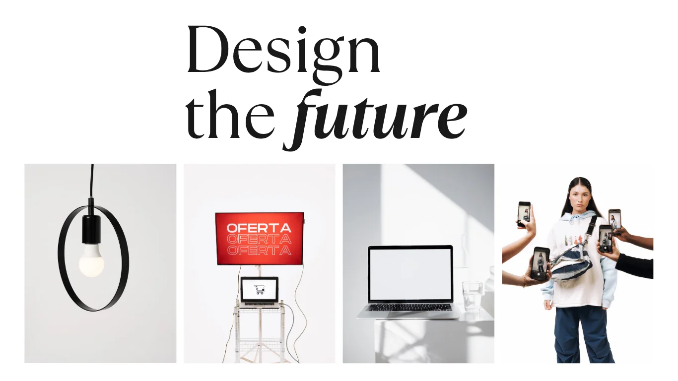
Contrast is the foundation of effective type pairing. Two fonts that look too similar can make a design feel flat, while fonts with just the right amount of difference create a polished look.
- Pair serif and sans-serif for classic balance.
- Combine a decorative display font with a neutral body font.
- Avoid pairing fonts that compete for attention (e.g., two bold display fonts).
Contrast in size, weight, and style strengthens hierarchy and keeps the reader engaged.
2. Establish a Clear Visual Hierarchy
The best designs guide the eye naturally. A reader should instantly recognize headlines, subheadings, and body text. To achieve this:
- Make headlines bold and large to capture attention.
- Use subheadings smaller and lighter to support the main point.
- Keep body text consistent for easy reading.
Hierarchy is not only about size it also includes color, alignment, and spacing. A darker headline with wide spacing will always stand out compared to lighter, smaller paragraphs.
3. Limit Yourself to Two or Three Fonts
Simplicity is powerful. Using too many fonts creates clutter and confuses the hierarchy. A professional approach is:
- One headline font (expressive, bold, or stylish).
- One body font (neutral, readable, versatile).
- An optional accent font (for highlights or quotes).
This structure builds consistency and ensures every element has its role in the hierarchy.
4. Match Fonts by Personality
Fonts have moods. Choosing the right personality is crucial for type pairing:
- Serif fonts = professional, formal, traditional.
- Sans-serif fonts = clean, modern, approachable.
- Script fonts = elegant, creative, personal.
- Display fonts = bold, eye-catching, unique.
Your type pairing should match the tone of the project. For example, a law firm’s brochure will likely use classic serif fonts, while a bakery’s branding might combine a playful script with a clean sans serif.
5. Use Scale, Spacing, and AlignmentHierarchy is reinforced by how text is arranged. Even when using the same font family, you can create strong hierarchy with:
- Scale: Larger sizes for headlines, smaller for body.
- Weight: Bold for emphasis, regular for readability.
- Spacing: More white space around key text draws attention.
- Alignment: Consistent left or center alignment for harmony.
Whitespace is particularly powerful it allows your typography to breathe and emphasizes important sections.
6. Test for Readability on All Devices
Good design must work everywhere. A font that looks elegant on a desktop may become unreadable on mobile. Always check:
- Font size: Ensure body text is at least 14–16px for screens.
- Contrast: Dark text on light backgrounds (or vice versa) improves legibility.
- Line spacing: Enough breathing room prevents text from feeling cramped.
Accessibility should always be part of hierarchy decisions your design isn’t effective if your audience can’t read it.
7. Stay Consistent Across All Platforms
Consistency creates professionalism. Whether it’s a website, Instagram graphic, or printed brochure, your chosen type pairings and hierarchy rules should remain the same.
Consistency ensures brand recognition. If your fonts change from one design to the next, the audience loses trust. But when everything aligns, your typography becomes part of your brand’s voice.
Bonus: Use Grids for Better Typography
Grids are underrated in typography. By aligning text within a grid system, you automatically create order and rhythm. Grids reinforce hierarchy by establishing predictable reading patterns, which is especially valuable in websites, magazines, and multicolumn layouts.
Common Mistakes in Type Pairing & Hierarchy
Avoid these errors to keep your designs polished:
- Pairing fonts that are too similar (no contrast).
- Using too many fonts (cluttered design).
- Over-relying on decorative fonts that reduce readability.
- Making everything bold or large (no clear hierarchy).
- Ignoring accessibility (poor contrast or tiny text).
By avoiding these pitfalls, your typography will always feel intentional and professional.

FAQs About Type Pairing & Hierarchy in Design
Q1. What is the golden rule of type pairing?
The golden rule is to create contrast without conflict. Fonts should look different enough to create hierarchy but still feel harmonious together.
Q2. How many fonts should I use in a single design?
Limit yourself to two or three fonts one for headlines, one for body text, and an optional accent font. More than that often looks messy.
Q3. How do I test if my hierarchy works?
Look away from your design and then glance back quickly. Your eye should immediately land on the headline, then the subheading, then the body text. If it doesn’t, adjust scale and spacing.
Q4. Which fonts pair best together?
Classic pairings include:
- Serif (Merriweather) + Sans-serif (Lato)
- Display (Playfair Display) + Sans-serif (Montserrat)
- Script (Pacifico) + Sans-serif (Open Sans)
Q5. Why is hierarchy important in web design?
On websites, hierarchy guides users to calls-to-action (like “Buy Now” or “Sign Up”). Without it, visitors may miss critical information.
Final Thoughts
Mastering type pairing & hierarchy in design is both an art and a science. Fonts are more than decorativethey are the voice of your design. By pairing complementary fonts, establishing clear hierarchy, and staying consistent, you can make your designs not only look beautiful but also communicate effectively.
Remember:
- Contrast creates interest.
- Hierarchy guides attention.
- Consistency builds trust.
With these 7 proven tips, your typography will elevate your designs, strengthen your brand, and engage your audience with clarity and style.


