Master File Formats and Resolution: The Ultimate 10-Step Guide for Designers
File Formats and Resolution are the unshakeable foundation of every great design. Ask any seasoned designer, and they’ll tell you a horror story: a gorgeous logo that looks pixelated on a website, a vibrant flyer that prints with dull colors, or a social media graphic that loads at a snail’s pace. These common nightmares almost always trace back to a fundamental misunderstanding of file formats and resolution.
Mastering File Formats and Resolution this core concept will save you countless headaches, elevate your work’s quality, and ensure your designs look impeccable everywhere they are displayed. This comprehensive guide will demystify the jargon, provide clear rules, and give you a practical checklist to follow for every project.

What Are File Formats and Resolution? The Core Concept
Let’s start with a simple analogy. Think of your digital image as a physical product you need to ship.
- File Formats are the container or the box. Is it a sturdy, reusable crate (like a PNG)? A compact, lightweight envelope (like a JPG)? Or a scalable, shape-shifting box (like an SVG)? Each container has a specific purpose.
- Resolution is the clarity and detail of the contents inside the box. A high-resolution image is packed with fine detail, while a low-resolution one is more of a rough sketch.
Using a high-quality format with the wrong resolution is like putting a priceless vase in a perfect crate but wrapping it in a blurry, low-detail cloth—it defeats the purpose. The reverse is equally frustrating.
A Brief History: Why So Many File Formats?
Understanding why different File Formats and Resolution were created is the key to choosing the right one.
- JPG (Joint Photographic Experts Group): Developed in the 1980s, its mission was to compress photographic images into manageable file sizes without a massive perceived loss in quality. It was a revolution for storage and web use.
- PNG (Portable Network Graphics): Arriving in the 1990s, it was designed as a powerful, patent-free successor to the GIF format. Its killer features were support for transparency and lossless compression, meaning the image quality doesn’t degrade when saved.
- SVG (Scalable Vector Graphics): Introduced in 2001, this format was built for the modern web. It represents images using mathematical paths and points, not pixels, allowing them to scale to any size without losing sharpness.
- PDF (Portable Document Format): Adobe created it in the 1990s to solve a universal problem: documents looking different on various computers and printers. It preserves fonts, images, and layout exactly as intended, making it a staple for print and digital documents.
As you can see, each File Formats and Resolution evolved to solve a specific problem. That history is baked into their functionality today.
Choosing the Right File Format: A Practical Guide
So, which “box” should you use? Here’s a breakdown by design scenario.
- PNG: Your go-to for graphics that require a transparent background. Perfect for UI icons, logos on websites, detailed screenshots, and any graphic where you don’t want a white box around it.
- JPG: The undisputed champion for photographs and complex images with gradients. Use it for social media graphics, blog banners, and email headers where small file size is a priority. Be mindful—its “lossy” compression means quality decreases every time you re-save it.
- SVG: Always use this for logos, icons, and any design element that needs to be scaled frequently. Because it’s vector-based, an SVG logo can be blown up to billboard size or shrunk to a favicon without any loss of quality.
- PDF: The professional standard for anything destined for print, as well as multi-page reports, presentations, and client-ready documents. It encapsulates all your design elements into a single, reliable file.
For a deeper dive into specific use cases, check out this excellent resource from Canva’s design school: Canva’s File Format Guide.
DPI vs. PPI: Demystifying the Confusion
This is a concept that trips up even experienced designers. Let’s clear it up.
- PPI (Pixels Per Inch): This refers to digital screens. It measures the density of pixels in a single inch on a device like a monitor, phone, or tablet. A higher PPI means more pixels are packed into that inch, resulting in a sharper, more detailed image.
- DPI (Dots Per Inch): This refers to physical printing. It measures how many tiny dots of ink a printer can place in a one-inch line. A higher DPI means more ink dots, resulting in a smoother, more professional-looking print with finer detail.
The Golden Rules:
- Web Graphics: 72 PPI is the long-standing standard, optimized for fast loading on screens.
- Print Designs: 300 DPI is the non-negotiable industry standard for sharp, high-quality prints (like business cards, brochures, and magazines).
- Large Format Printing (Banners, Billboards): 150 DPI is often sufficient because these are viewed from a distance, where the lower density is not noticeable.
For a technical deep dive, Adobe’s official guide is an invaluable resource: Adobe Photoshop Resolution Guide.
When to Use High, Medium, and Low Resolution
Choosing the right resolution is about context.
- High Resolution (300+ PPI/DPI): Mandatory for all print projects, professional photography, and any graphic where fine detail is critical.
- Medium Resolution (150-200 PPI): Suitable for large-scale marketing materials viewed at a moderate distance, like posters or presentation slides.
- Low Resolution (72-100 PPI): Exclusive use for digital screens. This includes website banners, email graphics, social media posts, and thumbnails where fast load times are essential.
Real-World Examples:
- An Instagram post: 1080px wide at 72 PPI (low resolution for fast loading).
- A business card: 3.5″ x 2″ at 300 DPI in a PDF (high resolution for crisp print).
The Designer’s 10 Essential Export Tips
Follow these rules to ensure flawless exports every single time.
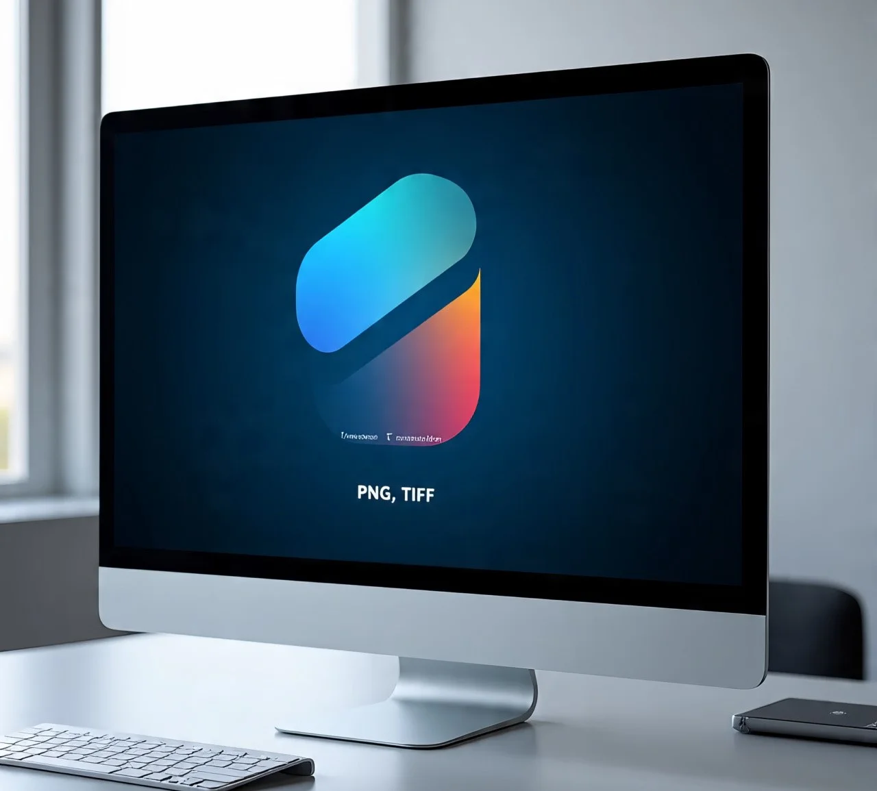
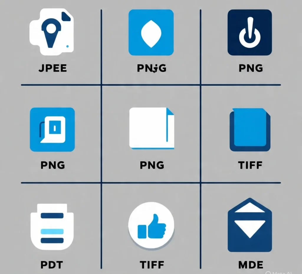
- Match the Format to the Goal: PNG for transparency, JPG for photos, SVG for scalability, PDF for print.
- Get Your Color Mode Right: Use RGB for anything on a screen and CMYK for anything going to a printer.
- Compress Web Files: Use tools like TinyPNG or Squoosh to reduce file size without sacrificing visible quality, improving website speed.
- Always Keep a Master File: Save your original, editable work in its native format (like .AI, .PSD, or .FIG).
- Export Multiple Sizes: For web work, export @2x and @1x versions for responsive design and retina displays.
- Check Your Transparency: Before exporting PNGs, double-check that there’s no unwanted white background hiding in the corners.
- Embed Fonts in PDFs: This ensures the document looks exactly the same on every machine, even if the recipient doesn’t have your fonts.
- Test on Multiple Devices: Preview your graphics on a phone, tablet, and desktop to catch any rendering issues.
- Save Logos as SVG: Make this an unbreakable habit. It future-proofs your logo for any application.
- Avoid Re-saving JPGs: Each save applies lossy compression, leading to a gradual and irreversible degradation of image quality, known as “generation loss.”
Common File Format and Resolution Mistakes to Avoid
Steer clear of these classic errors to maintain your professional reputation.
- Using JPG for Logos: This creates jagged edges and a blurry mess when scaled. Always use SVG or PNG.
- Sending 72 PPI Images for Print: This will result in a pixelated, low-quality print that will disappoint any client.
- Forgetting the RGB to CMYK Switch: Colors can look vibrant on screen (RGB) but dull and muted in print (CMYK) if not converted.
- Exporting a Single File Version: Provide clients with the right file for the right context—a web-ready PNG and a print-ready PDF, for example.
Quick Reference Table
| Format | Best For | Pros | Cons | Resolution Use |
|---|---|---|---|---|
| PNG | Icons, Web Graphics, Transparency | High Quality, Lossless, Transparency | Larger File Size | 72-150 PPI |
| JPG | Photos, Banners, Complex Images | Small File Size, Universal Support | Lossy Compression, No Transparency | 72-150 PPI |
| SVG | Logos, Icons, Scalable Graphics | Infinitely Scalable, Tiny File Size | Not for Photographic Images | Any (Vector) |
| Print, Reports, Documents | Preserves Layout/Fonts, Print-Ready | Larger Size, Not for Web Graphics | 300+ DPI |
Conclusion: Your Ultimate File Format and Resolution Checklist
To become a master of file formats and resolution, internalize this final checklist:
- Format Choice: PNG = transparency, JPG = photos, SVG = scalable, PDF = print.
- Resolution Rule: 72 PPI = web, 300 DPI = print.
- Color Mode: RGB = screens, CMYK = ink.
- Best Practice: Keep a master file, compress for web, and always test.
By mastering these fundamental principles, you will eliminate the frustration of blurry graphics, ensure client satisfaction, and produce professional, high-quality work across every medium. For more on creating effective digital experiences, explore our guide on Design Principles for Web UX.